Flirting opposites
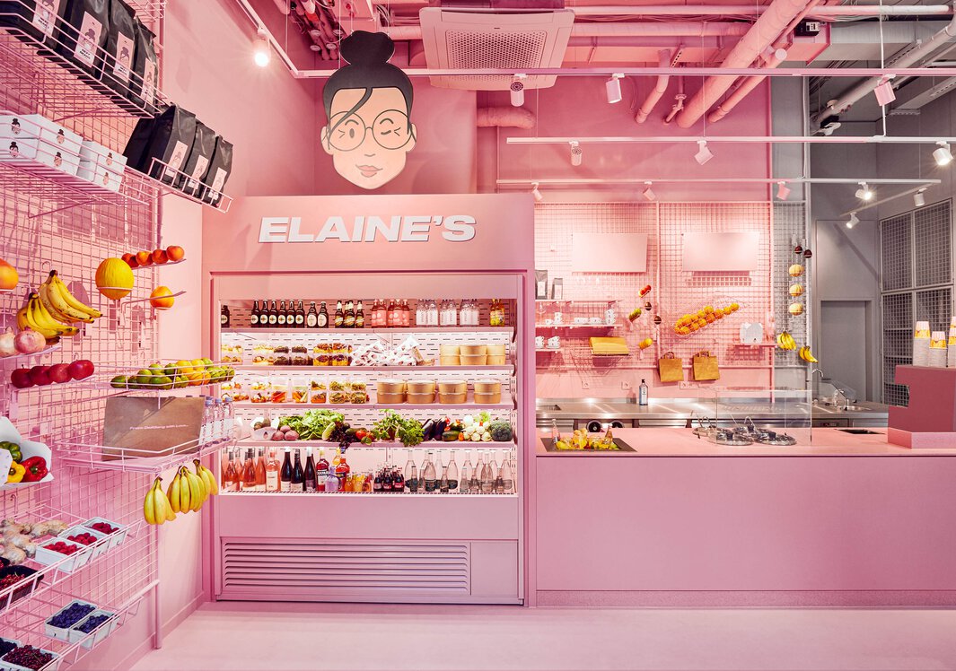
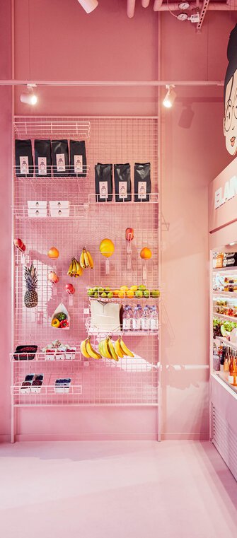
Elaine's Takeaway naturally and cleverly combines two worlds. The design brief was a dual colour concept, "bespoke and positively crazy". This happened on 40m2 of sales space in Frankfurt's banking and railway station district. The chic snack bar was to both attract attention like a colourful dog, while also making an impact through visual freshness, lightness, and the unique presentation of its goods. A job made for the architectural firm VRAI and its core values of care, enthusiasm, and good taste.
VRAI declared the contrast of shop and location to be its design mantra. Half of Elaine's interior is grey, the other pastel pink. From the ceiling to the counter, the architects’ design creates pleasant confusion at first before its ambiguity becomes enchanting. Managing Director Jana Vonofakos is convinced that "quality shows in the little things". Her attention to detail and soft spot for materials comes to small-scale perfection at Elaine's. That's why the binary colour scheme boldly extends to the two-tone coated coffee maker.
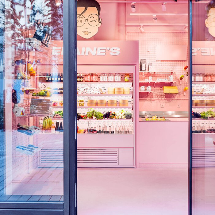
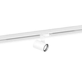
The lighting in the takeaway is also crucial to make snacks appetising from the outside. "Light gives structure to a space and affects people's mood," Vonofakos says. She enjoys the challenge and "playing with light". SQUBE ON TRACK has become the light of the moment. Thanks to its particularly high colour rendering values, products are tastefully displayed, and with the 3-phase track spotlights can be connected and controlled separately.
